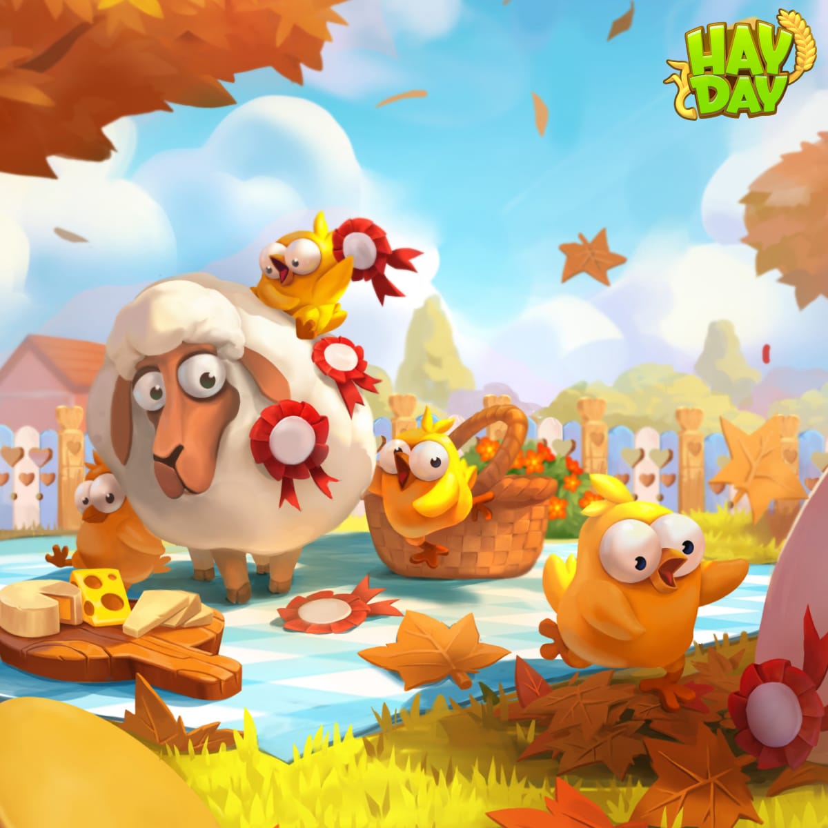
Hay Day is a farming simulation game where players grow crops and feed livestock. They can sell goods in exchange for coins and experience points. By earning enough experience points, players level up, unlocking new features such as crops, goods, and livestock.
Since its release in 2012, Hay Day remains one of the most beloved farming mobile games on the market. Our challenge is to refresh its marketing look and feel to keep existing fans engaged while attracting new players.
My task was to approach the branding with a fresh perspective, suggest solutions for current marketing challenges, restore consistency in the look and feel of Hay Day's brand and marketing visuals, and capture the game’s unique tone of voice while maintaining its brand integrity.
Client
Supercell
Responsibilities
Branding
Year
2024
Tools
Adobe Creative Suite
Figma
Challenges
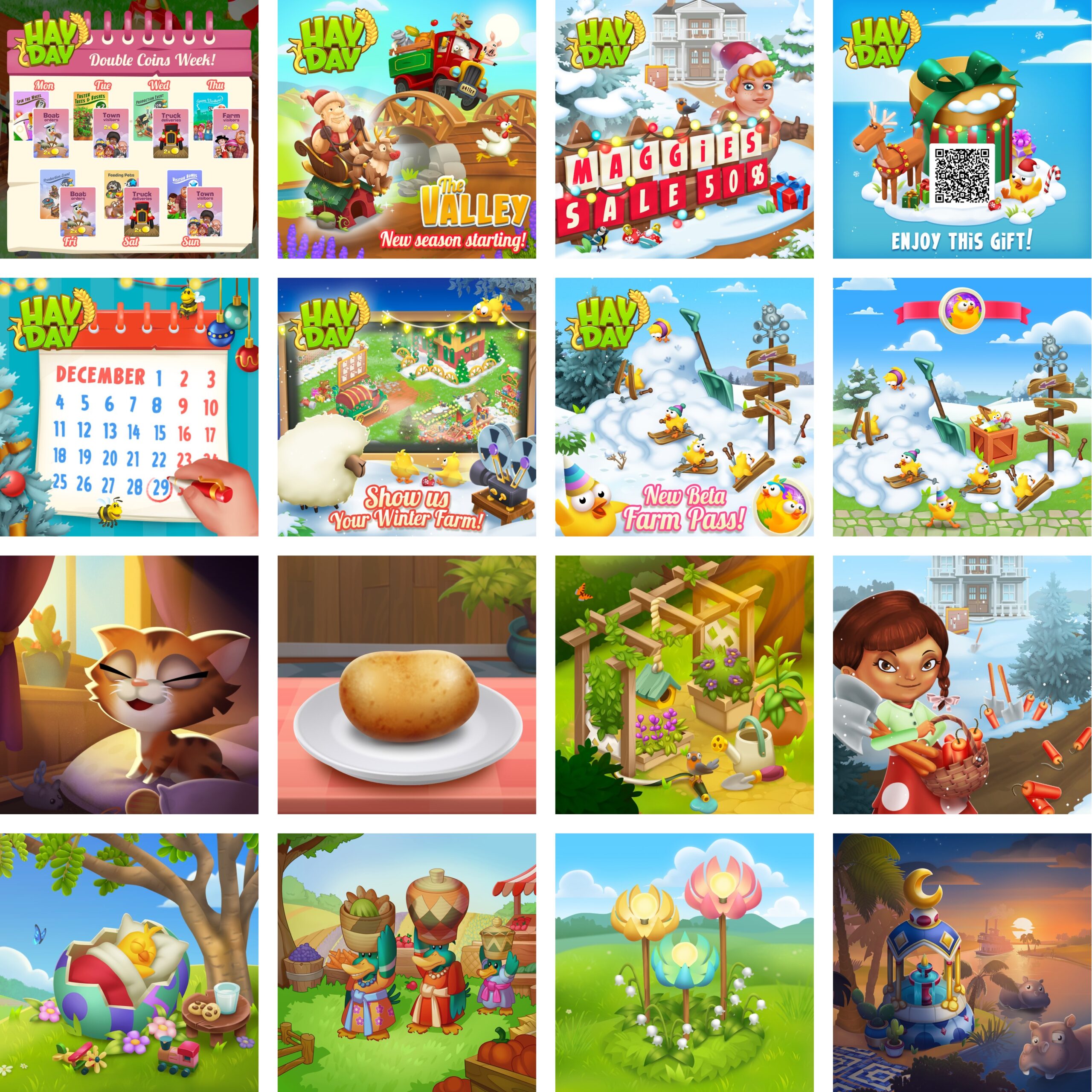
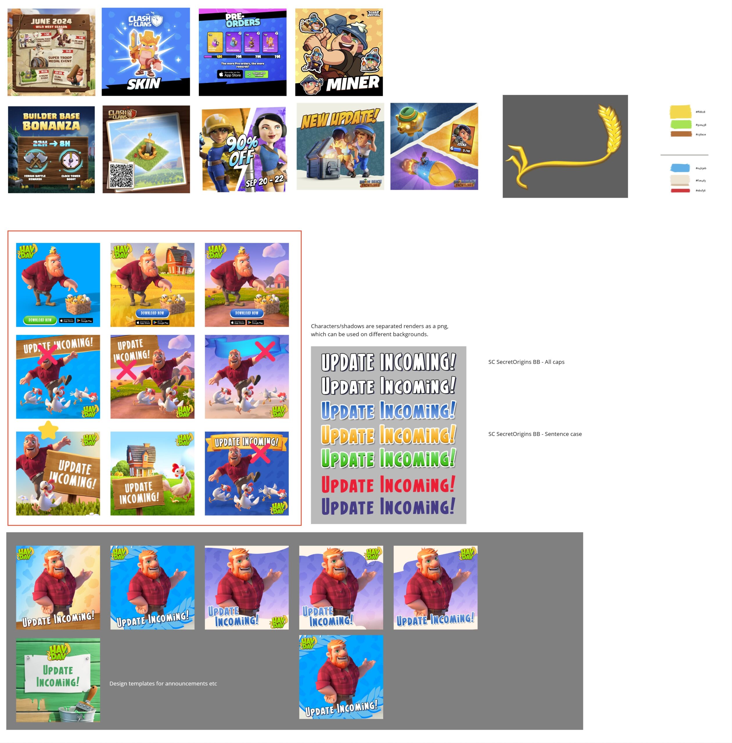
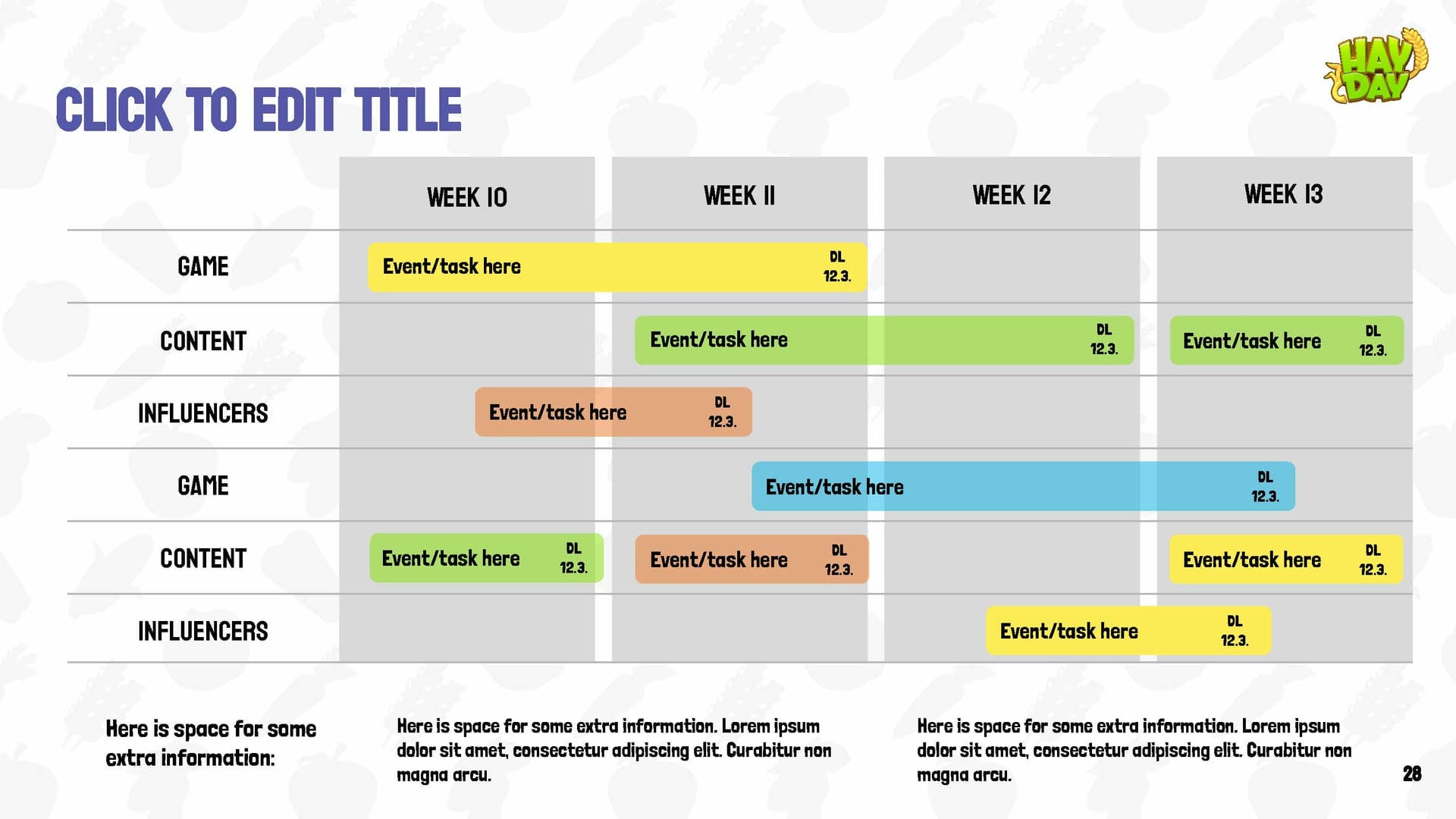
As a game over 10 years old, Hay Day faces the challenge of inconsistent visuals and marketing communication that have been produced over the years. Multiple parallel pipelines have been attempting to achieve the same goal inefficiently, without clear brand guidelines or direction. This lack of consistency and quality in externally facing content has led to cost-ineffective outputs and confusion.
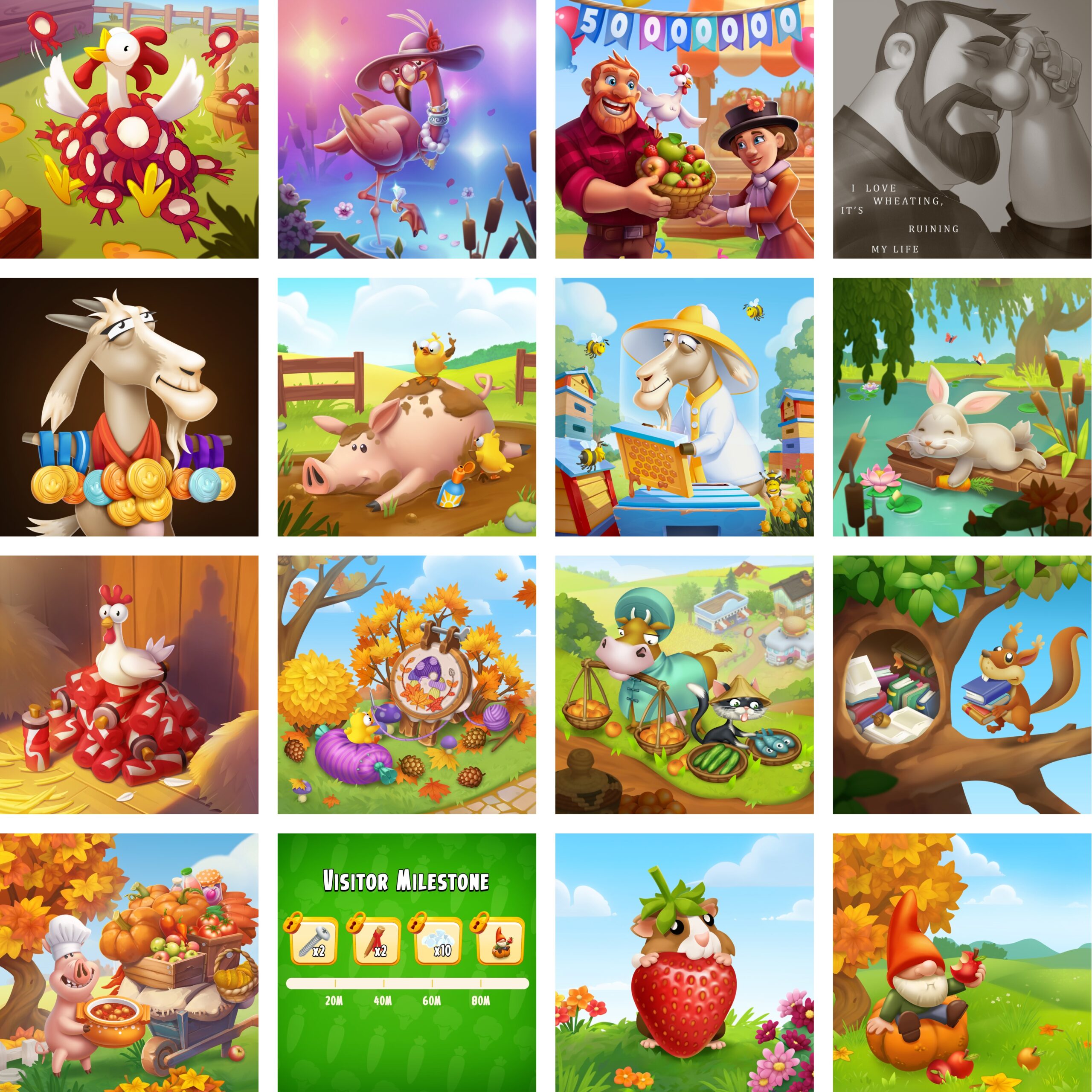
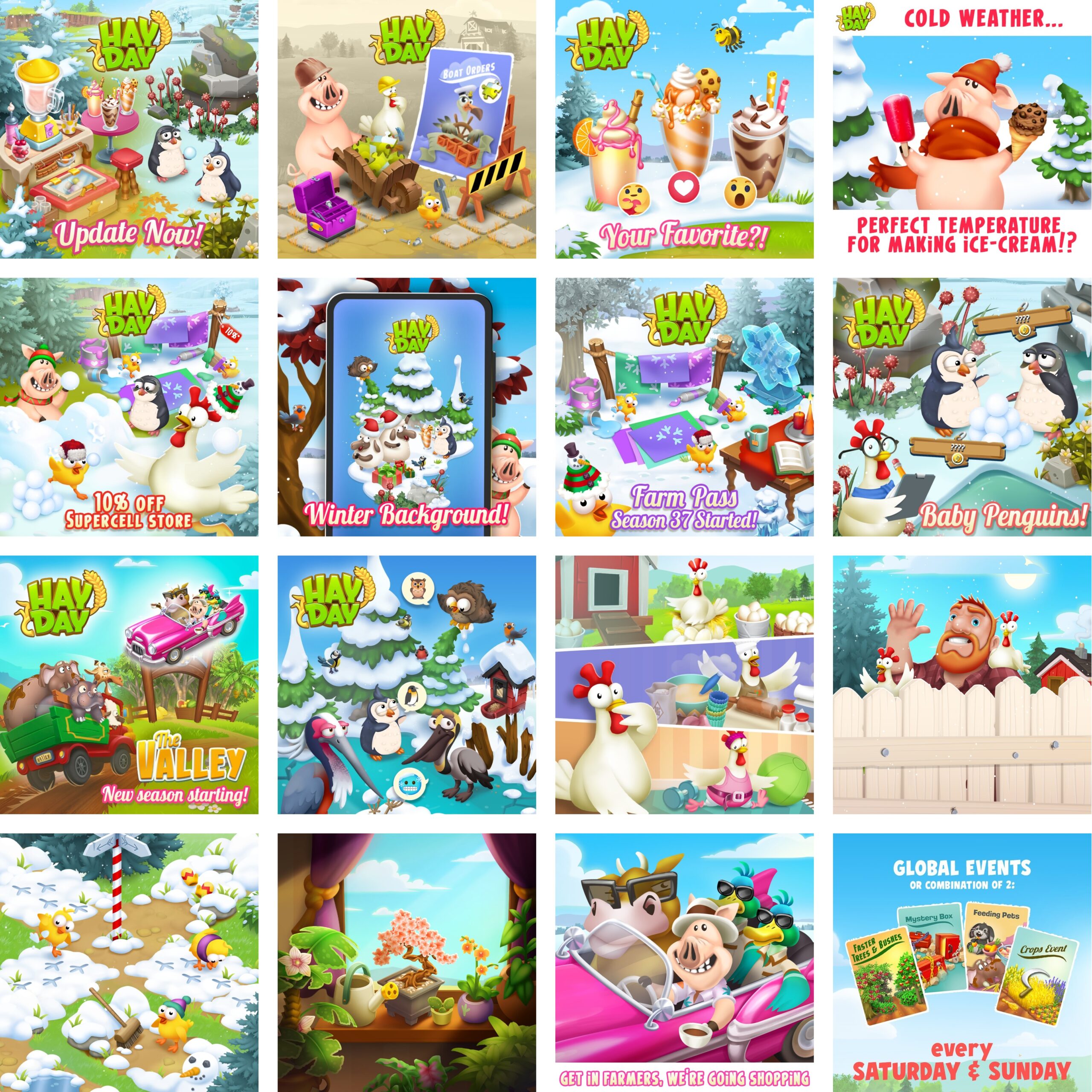
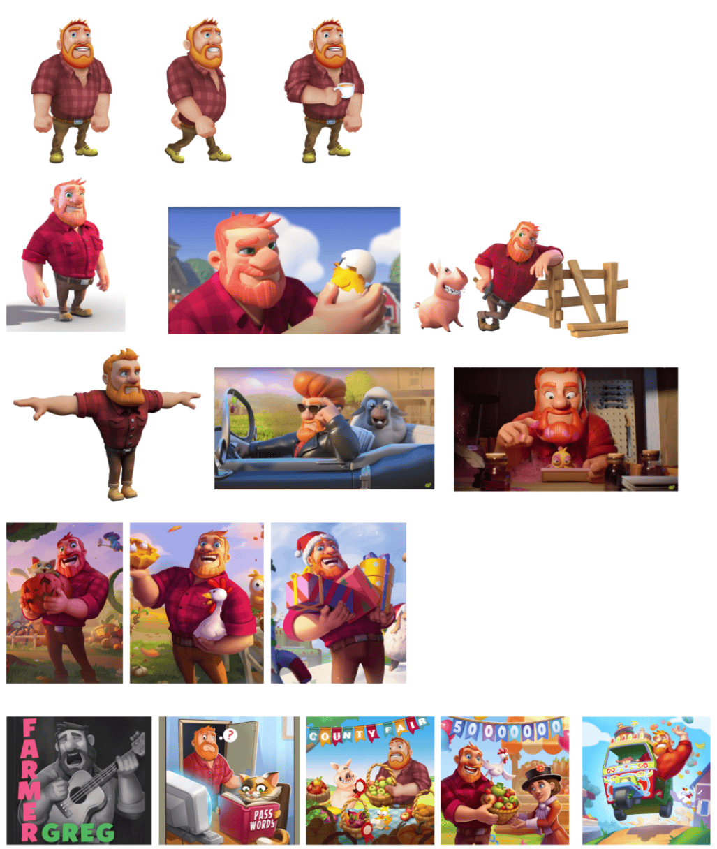
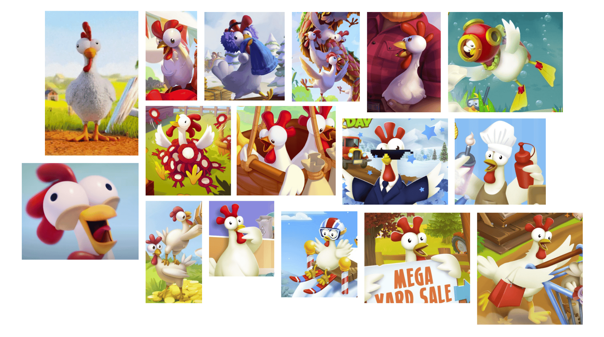
Social media content relies heavily on complex illustrations, straining individuals. Inconsistent character designs from multiple external partners. There is a noticeable lack of communication and collaboration between different teams, further exacerbating these challenges.
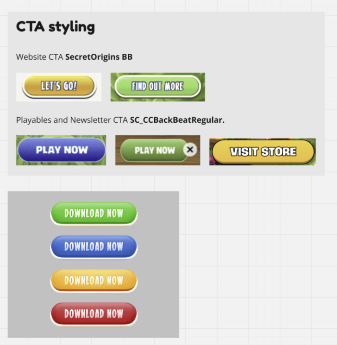
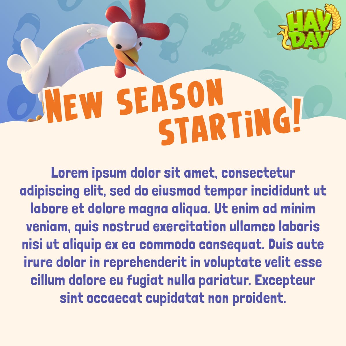
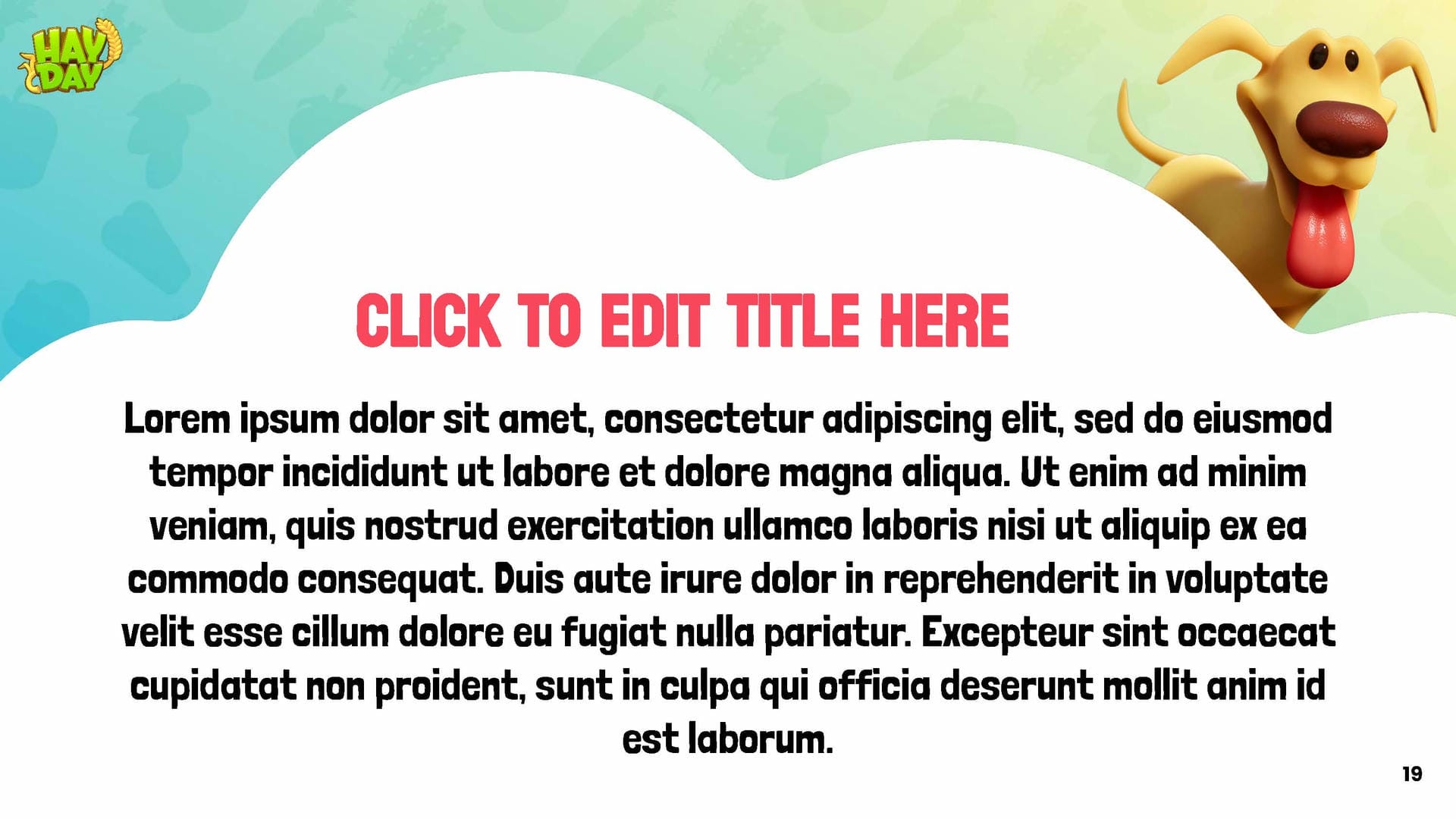
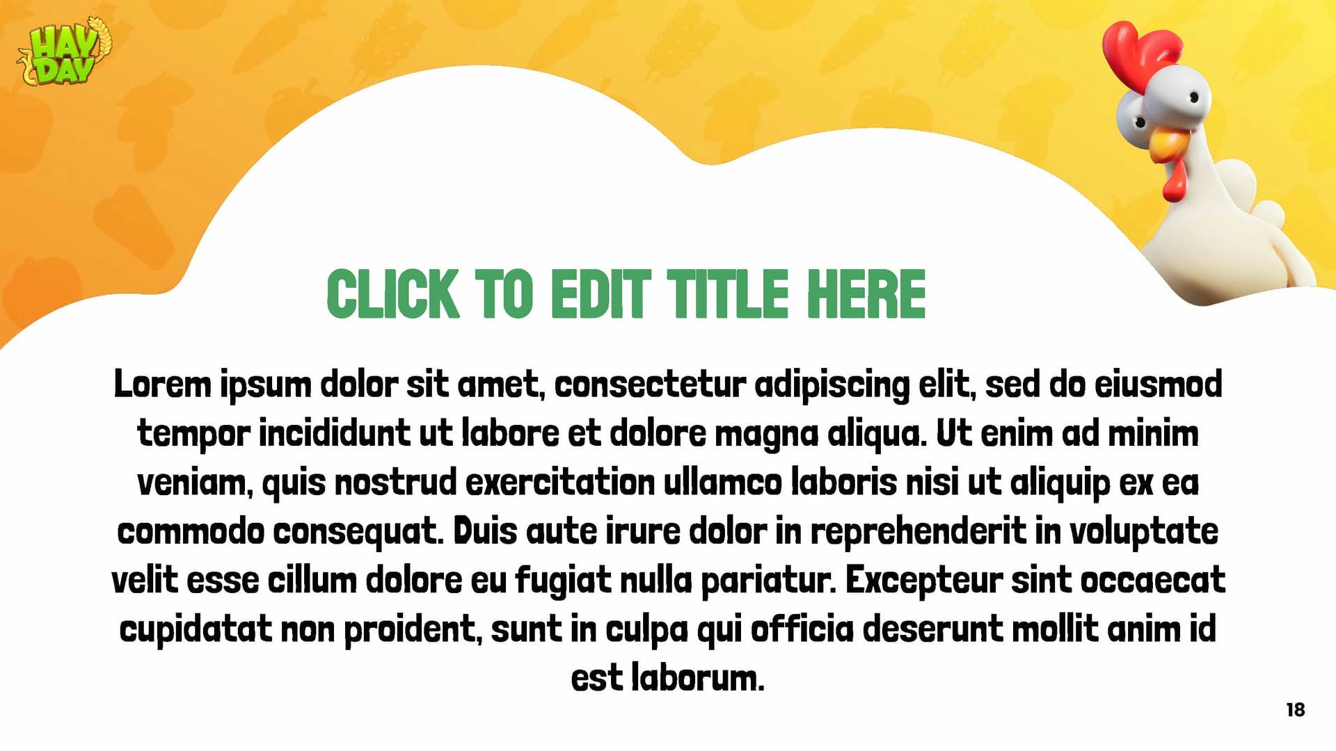
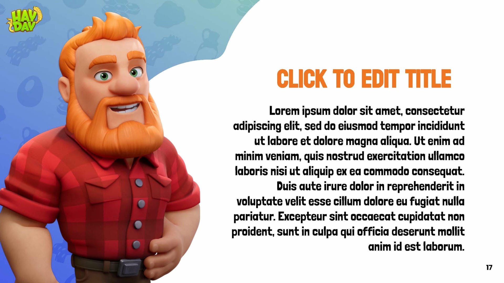
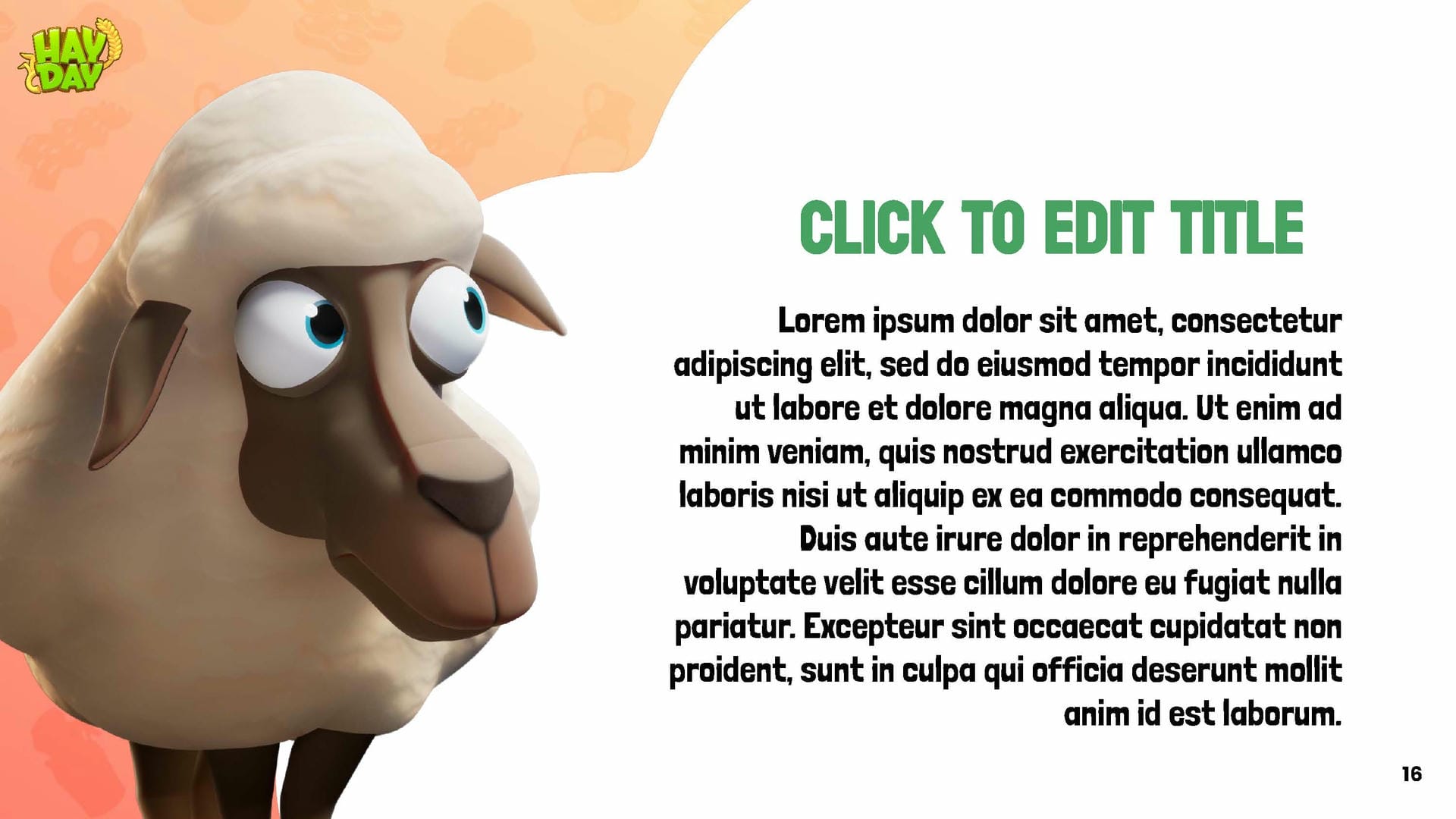
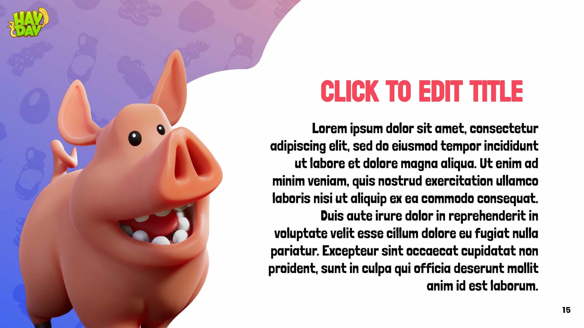
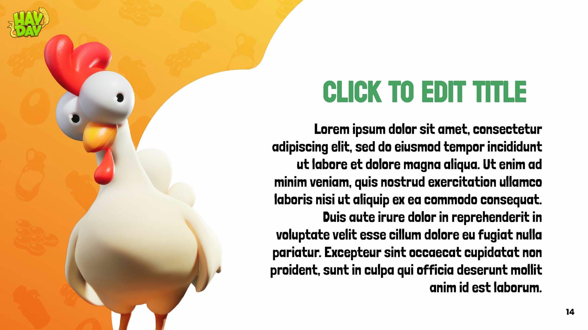
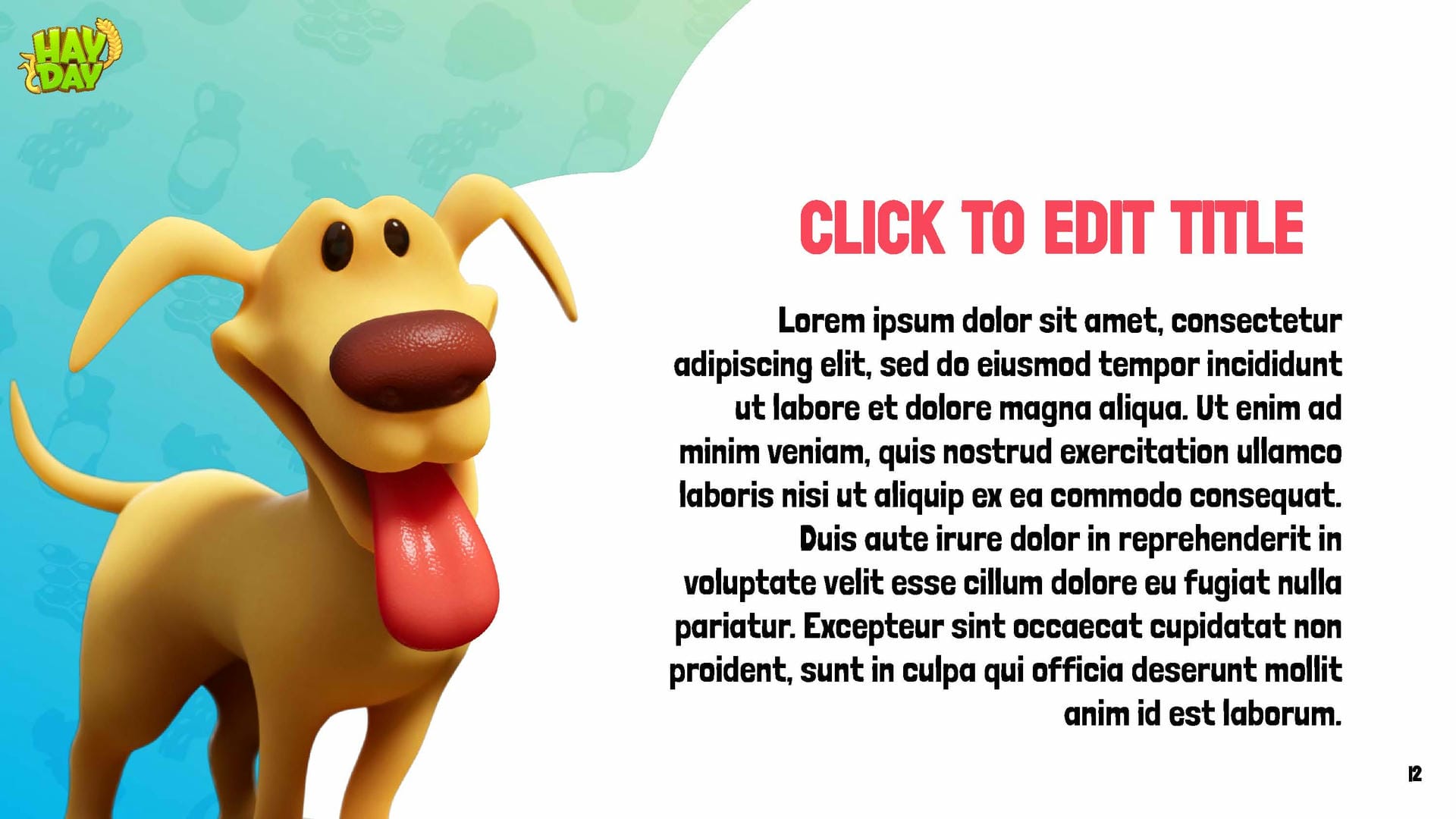
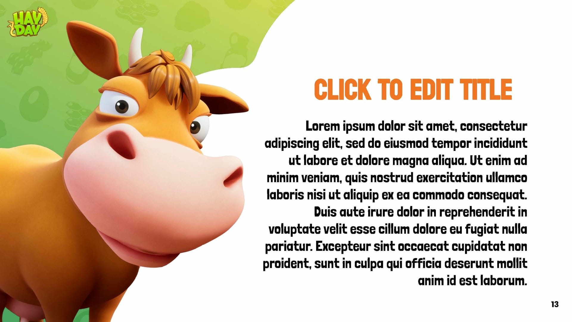
Outdated characters are still being used in the presentation templates, with inconsistent usage between 2D and 3D styles. Additionally, there are legibility issues with the fonts and colours.
Early studies
We reviewed all marketing creatives from 2023–2024, identified known issues and explored opportunities. Additionally, we analysed Hay Day Pop — a game that has been sunset but offers valuable insights into art direction and style for a modern Hay Day aesthetic. We also examined other Supercell games to ensure the new Hay Day visual messaging aligns with the broader Supercell universe.
Solutions
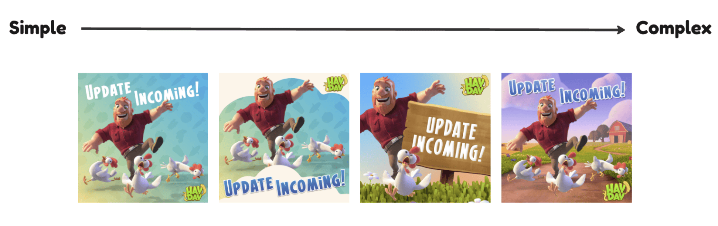
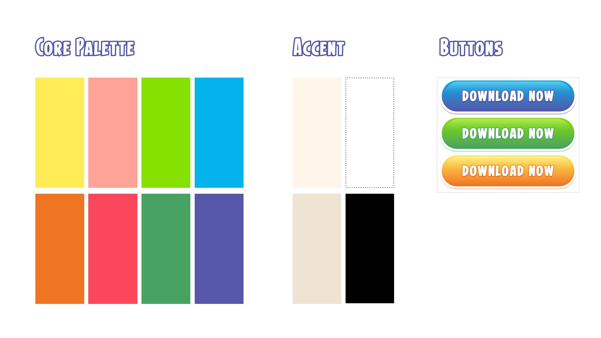
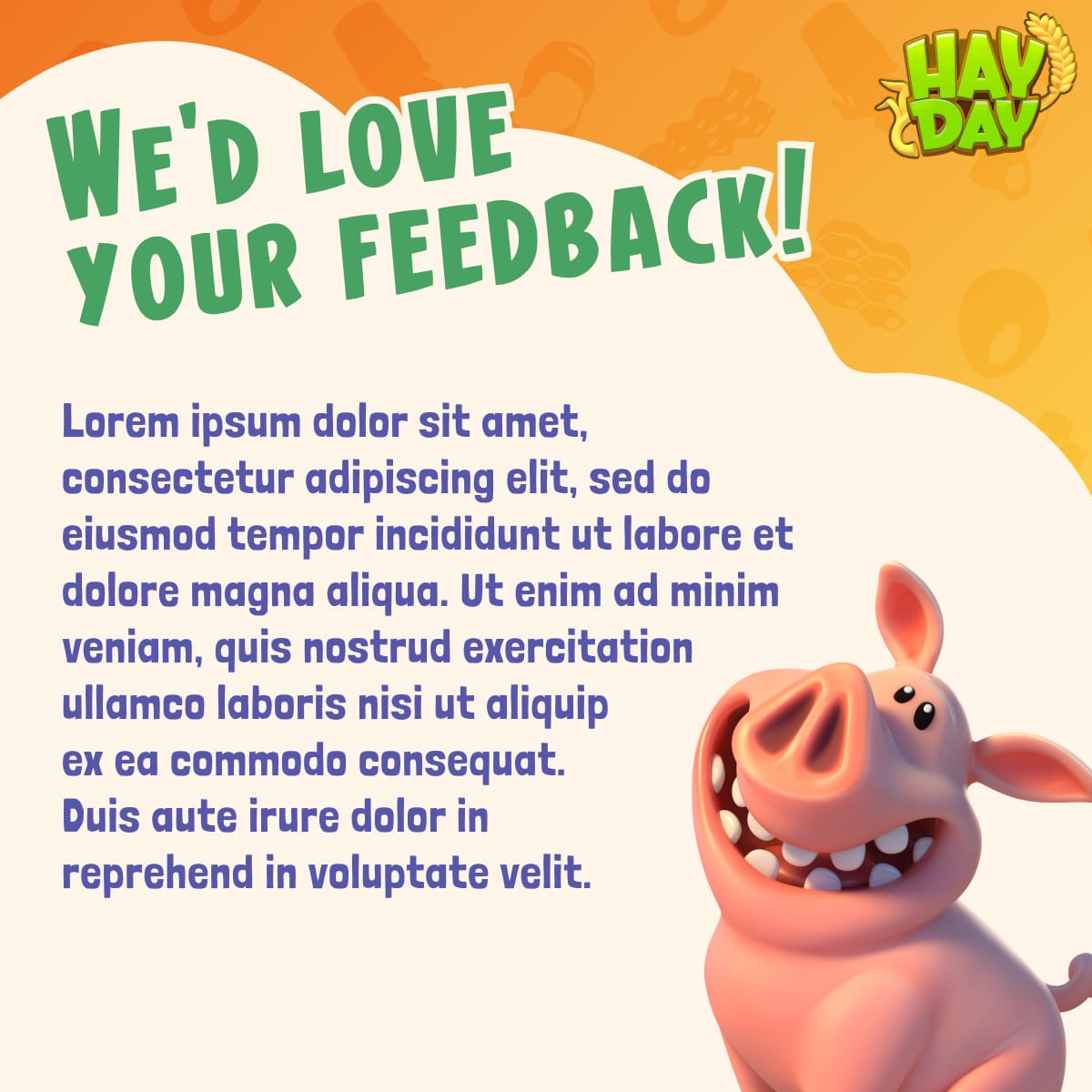
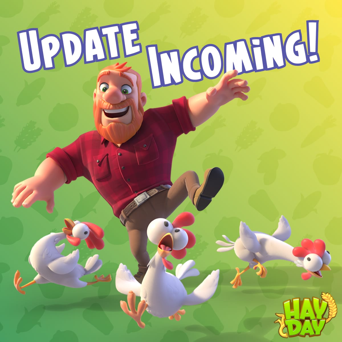
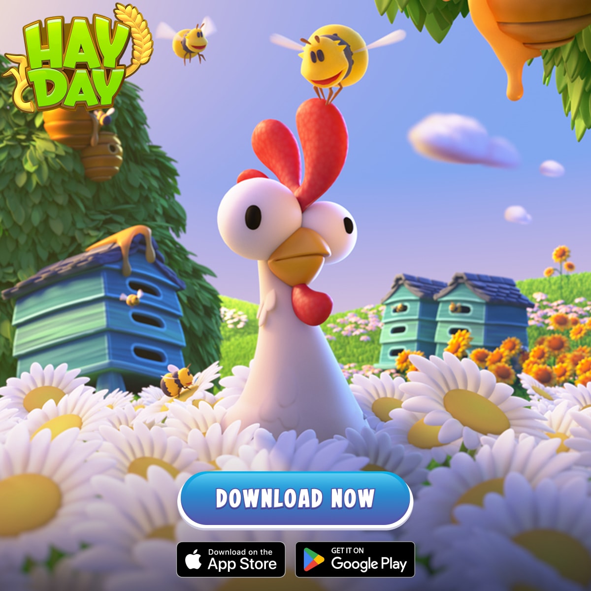
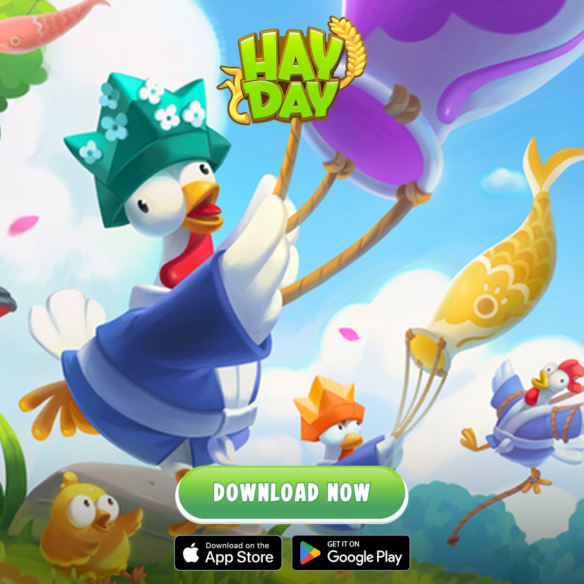
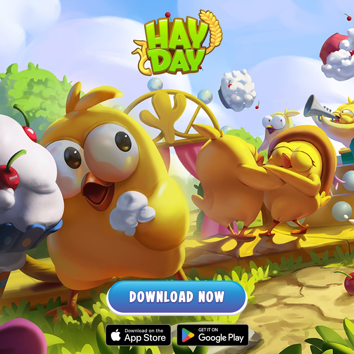
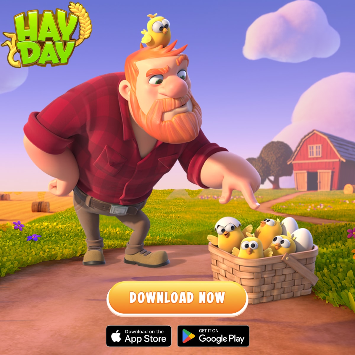
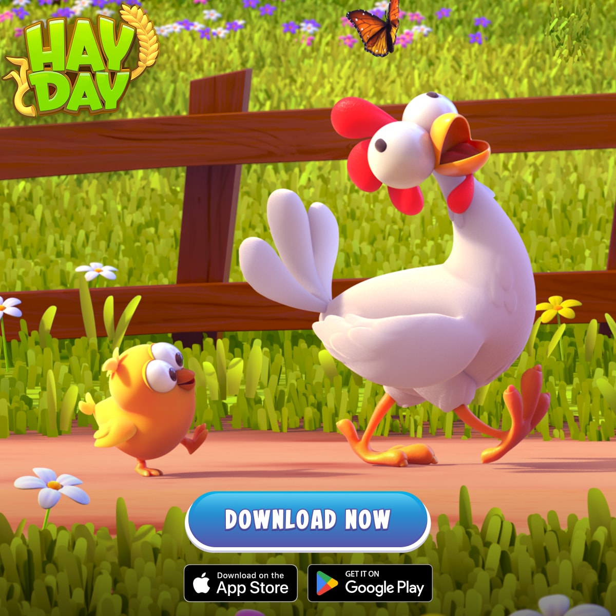
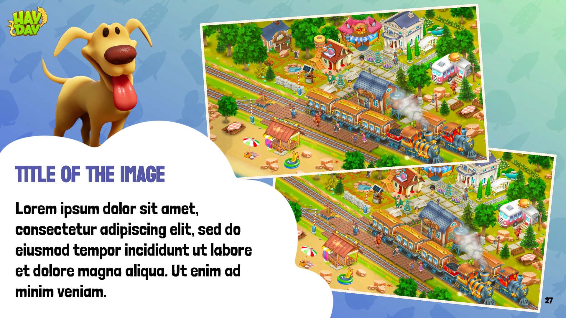
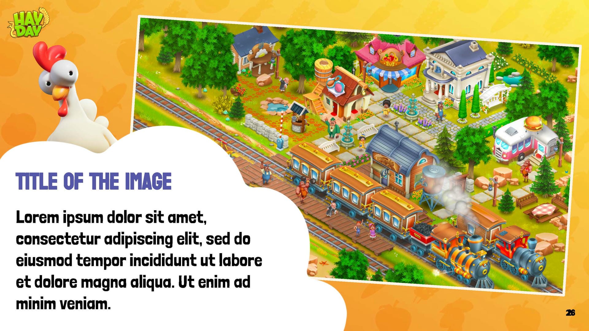
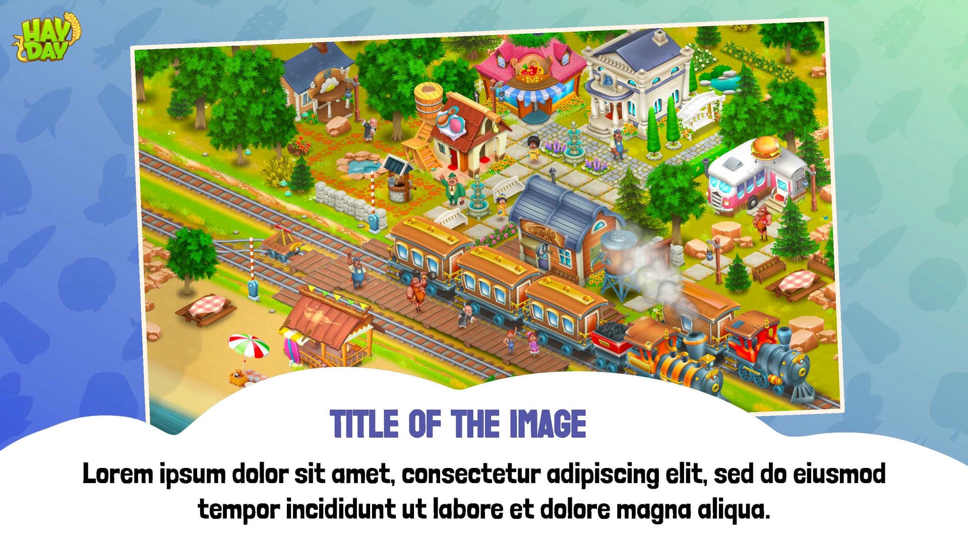
Our goal is to create a new Hay Day brand guideline to standardise all content. We revisited colours, backgrounds, typography treatments, UI elements and 2D/3D character assets, while also introducing new elements such as cloud-shaped containers, patterns, a new body font, increased use of 3D visuals, updated templates and layouts. This has resulted in a defined style that delivers cohesive visuals and reduces the need for costly, bespoke illustrated content.
The new style strengthens the message that Hay Day is a Supercell game, with clear and up-to-date marketing visuals.